Onboarding users: imagine your product as an unknown city
What are your users thinking when they navigate through your product for the first time? Can they find their way?
Putting ourselves in the shoes of new users takes great effort and is easy to forget. Especially when working on the same product for a long time. To design understandable products we need to empathise with those who know less.
So, how do new users feel? Let’s explore an analogy of cycling in a city you’ve never been before.
Try to remember the feeling of cycling in a new city for the very first time. Not knowing the way, having doubts every second intersection. What did you feel? It might be wonder and excitement, but also a feeling of disorientation. Everything is new, but together with your good friend Google Maps you’ll find your way.
Orientation and flow
In a new city your orientation leaves much to be desired. You don’t know the surroundings, you don’t have anchor points and you don’t know the layout of the streets. But this will quickly change. The longer you move around in the new city, the less you need Google Maps. Your mental model of the city, the internal map in your head is growing. Orientation is improving.
Orientation: Where am I and how do I navigate to my goal?
Then there is flow. How easy can you move trough the city and reach your goal? Is it safe? Does the city helps you avoiding mistakes? Bad roads, lots of traffic lights or a lack of cycling paths hinders flow.
Flow: Can I move smoothly towards my goal?
After a few years, your internal map of the city will grow strong. You navigate flawlessly, creating routes in your head. Obstacle in the way interrupting flow? No problem, you’ll generate a new route on the fly. The city is now a place you feel at home.
Using a new product
When you start using a new product the ideas of orientation and flow still apply. You wonder around and feel a bit disoriented. Only this time you can’t ask Google Maps to help you. No matter how ‘easy to use’ the product is, you need a certain amount of time to orientate yourself. Every interaction, every wrong turn adds to your mental modal of the product. How quickly you create this mental model depends on the design of the interface.
Today, interface design focusses a great deal of the effort on flow. A good flow provides seamless experiences for users performing certain tasks. Reducing clicks, providing clear error messages and minimising distraction. But what if you can’t find the right screen or don’t feel certain if you’re on the right spot? Then flow is useless.
Creating orientation
How can we help the user to orientate in our products? Let’s take a look at how we orientate in cities:
- With a map or guide if you’re very new, for example Google Maps.
- With recognisable route signs and anchor points along the road. For example prominent buildings or canals.
- With important roads you can always fall back to. For example a big roads, central crossroads or squares.
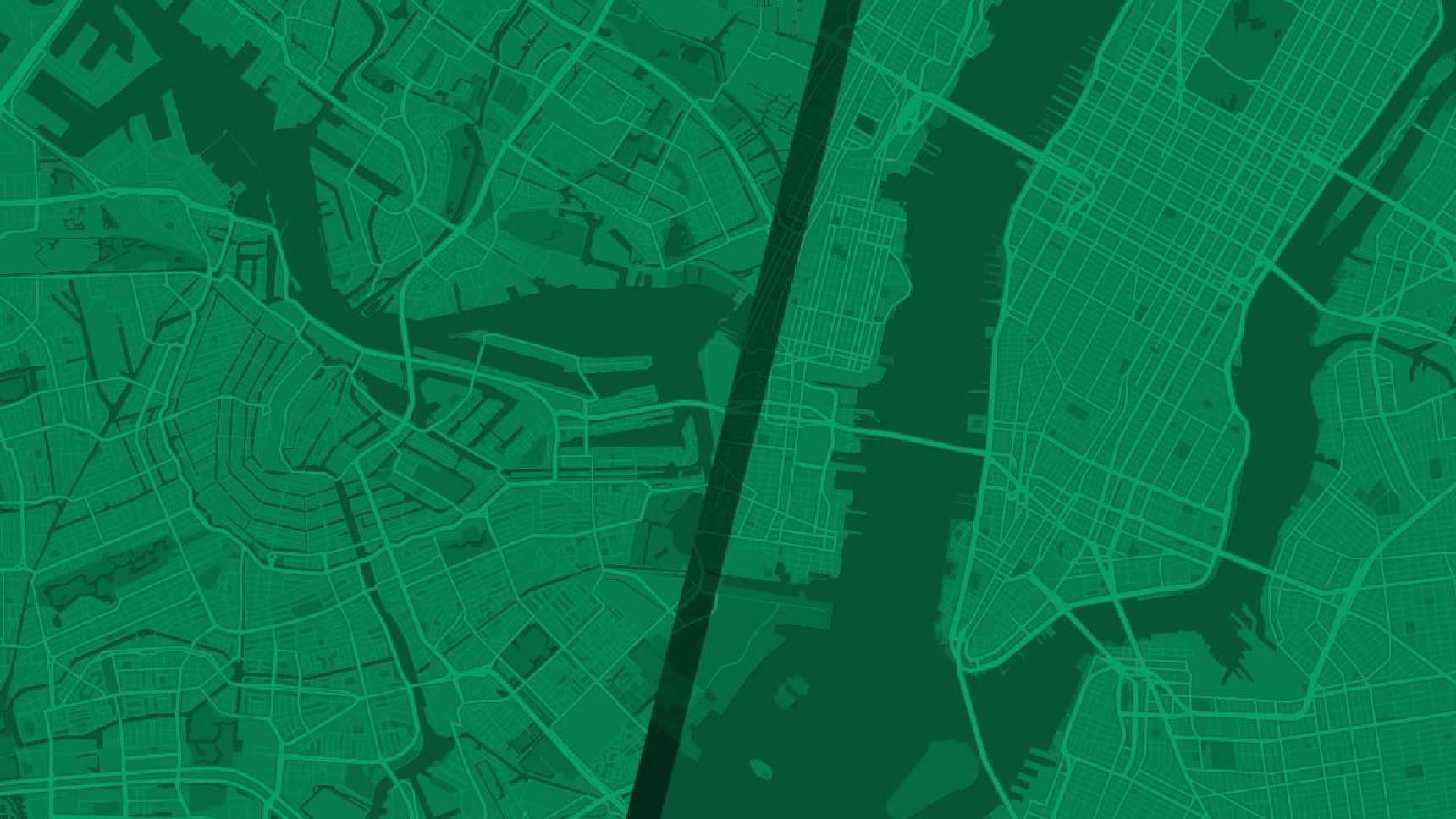
- A street system that is comprehensible. For example the street/avenue system in Manhattan.
- And eventually: with our own internal map of the city.
What can we learn from this to help our users create their internal map as fast as possible?
- Provide a simple onboarding procedure for the very new. For example a tour or a short video.
- Use proven design patterns users already know. Don’t try to be too unique. Rely on familiar principles. A simple example: don’t provide more than 7 choices at a time (imagine standing at a crossroad with 7 branches!). Also don’t use icons without text for navigation.
- Provide orientation by creating recognisable anchor points. For example visual elements that give a sense or where you are in the app and how pages and processes are related. Think about core user flows: do they jump out so the user cab get a quick grip on them? Let the user experience success quickly.
- Create a structure which is easy to follow. Does the page structure and navigation makes sense? Are pages located where you would expect them? Does it give them confidence they’re in the right spot?
Truth to be told, it’s not always straightforward. Every product, like every city, has weaknesses. Many cities don’t have an easy street systems like the one in Manhattan. To give an example: the street system in Amsterdam is complex. Efficient waterways were more important in the past. The canals provide orientation but it takes the visitor longer to adapt.
Some products cover complex matter, so straightforward structures might not be possible. Some products have long histories and big changes might not come easy. Identify the weaknesses and adapt using the techniques above.
Be a Manhattan
As the architect of an interface it is easy to forget how it feels to use your product for the first time. Every user needs some form guidance in the beginning. From time to time, imagine your product as a big unknown city. In the end, the chance that a new user stays is a function of the onboarding flow, the complexity of the product and the perseverance of the user.
So my advice would be: if possible, make your product a Manhattan, not an Amsterdam.